Widgets
ImmyGo provides widgets at two levels. This document covers both, with the declarative ui package shown first (recommended) and the lower-level widget package shown second.
Declarative Pattern (ui package)
import "github.com/amken3d/immygo/ui"

// Create views inline — no pre-declaration needed for stateless views
ui.Text("Hello").Title()
ui.Button("Click").OnClick(fn)
ui.Divider()

// Stateful views must be created outside the build function
name := ui.Input().Placeholder("Name")
toggle := ui.Toggle(false)
Lower-Level Pattern (widget package)
import "github.com/amken3d/immygo/widget"

// Always declare at package level (state must persist across frames)
var btn = widget.NewButton("Click").WithOnClick(fn)

// Render in layout function
btn.Layout(gtx, th)
Text
Renders styled text with the typography scale.
Declarative
ui.Text("Hello world")                    // Body text
ui.Text("Page Title").Headline()          // Large headline
ui.Text("Section").Title()                // Medium headline
ui.Text("Small print").Caption()          // Caption
ui.Text("Fine print").Small()             // Small body
ui.Text("Important").Bold()               // Semi-bold title
ui.Text("Hero").Display()                 // Largest text
ui.Text("Centered").Center()              // Center-aligned
ui.Text("Colored").Color(ui.RGB(255,0,0)) // Custom color
ui.Text("Limited").MaxLines(2)            // Truncate after 2 lines
Lower-Level
widget.H1("Heading")              // HeadlineLarge
widget.H2("Heading")              // HeadlineMedium
widget.H3("Heading")              // TitleMedium
widget.Body("Text")               // BodyMedium
widget.Caption("Small")           // LabelSmall

widget.NewLabel("Custom").
    WithStyle(widget.LabelHeadline).
    WithColor(th.Palette.Primary).
    WithAlignment(text.Middle).
    WithMaxLines(2).
    Layout(gtx, th)
Button
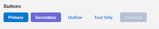
A clickable button with six built-in variants.
Declarative
ui.Button("Primary").OnClick(func() { fmt.Println("clicked") })
ui.Button("Secondary").Secondary()
ui.Button("Outline").Outline()
ui.Button("Text Only").TextButton()
ui.Button("Disabled").Disabled()
Buttons are automatically cached by label — safe to create inside the build function.
Lower-Level
var saveBtn = widget.NewButton("Save").
    WithVariant(widget.ButtonSuccess).
    WithCornerRadius(12).
    WithMinWidth(120).
    WithOnClick(saveHandler)

// In layout:
saveBtn.Layout(gtx, th)
Variants
| Variant | Declarative | Lower-Level Constant |
|---|---|---|
| Primary (default) | ui.Button("X") |
widget.ButtonPrimary |
| Secondary | .Secondary() |
widget.ButtonSecondary |
| Outline | .Outline() |
widget.ButtonOutline |
| Text | .TextButton() |
widget.ButtonText |
| Danger | — | widget.ButtonDanger |
| Success | — | widget.ButtonSuccess |
Input / TextField
Text input fields with placeholder, focus states, and variants.
Declarative
// Create outside build function (holds text state)
name := ui.Input().Placeholder("Full name")
email := ui.Input().Placeholder("Email").OnChange(func(text string) {
    fmt.Println("typed:", text)
})
pass := ui.Password()                    // Masked input
search := ui.Search()                    // Rounded search style
multi := ui.Input().MultiLine()          // Multi-line
disabled := ui.Input().Disabled()

// Read/write values
fmt.Println(name.Value())
name.SetValue("Alice")
Lower-Level
var nameField = widget.NewTextField().WithPlaceholder("Name...")
var bioField = widget.NewTextArea().WithPlaceholder("Bio...")
var searchField = widget.NewSearchField()
var passField = widget.NewPasswordField()

// In layout:
nameField.Layout(gtx, th)

// Read value:
nameField.Text()
nameField.SetText("Alice")
Toggle
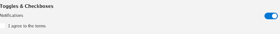
A Fluent Design switch with smooth knob and track animation.
Declarative
darkMode := ui.Toggle(false).OnChange(func(on bool) {
    fmt.Println("dark mode:", on)
})

// Read: darkMode.Value()
// Write: darkMode.SetValue(true)
Lower-Level
var darkMode = widget.NewToggle(false).
    WithOnChange(func(on bool) { ... })

darkMode.Layout(gtx, th)
Checkbox
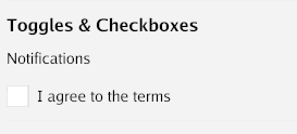
A checkbox with label and animated check mark.
Declarative
agreed := ui.Checkbox("I agree to terms", false).
    OnChange(func(checked bool) { ... })

// Read: agreed.Value()
Lower-Level
var agreed = widget.NewCheckbox("I agree", false).
    WithOnChange(func(checked bool) { ... })

agreed.Layout(gtx, th)
Slider
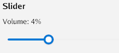
A horizontal range input with drag interaction.
Declarative
volume := ui.Slider(0, 100, 50).OnChange(func(v float32) {
    fmt.Printf("Volume: %.0f\n", v)
})

// Read: volume.Value()     (returns actual value between min/max)
// Write: volume.SetValue(75)
Lower-Level
var slider = widget.NewSlider(0, 100, 50).
    WithOnChange(func(v float32) { ... })

slider.Layout(gtx, th)
slider.ActualValue() // current value in min..max range
RadioGroup
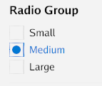
Mutually exclusive radio buttons with animated selection.
Declarative
size := ui.RadioGroup("Small", "Medium", "Large").
    Selected(1).   // pre-select Medium
    OnChange(func(index int) {
        fmt.Println("Selected:", index)
    })

// Read: size.SelectedIndex(), size.SelectedText()
Lower-Level
var radio = widget.NewRadioGroup("Small", "Medium", "Large").
    WithSelected(1).
    WithOnChange(func(index int) { ... })

radio.Layout(gtx, th)
Dropdown
A selection combo box with popup overlay.
Declarative
role := ui.Dropdown("Developer", "Designer", "Manager").
    Placeholder("Select role").
    OnSelect(func(index int, item string) {
        fmt.Printf("Selected: %s\n", item)
    })

// Read: role.Selected(), role.SelectedText()
Lower-Level
var dd = widget.NewDropDown("Developer", "Designer", "Manager").
    WithPlaceholder("Select role")

dd.Layout(gtx, th)
Card
A surface container with elevation (shadow) and rounded corners.
Declarative
ui.Card(
    ui.VStack(
        ui.Text("Title").Bold(),
        ui.Text("Content goes here."),
    ).Spacing(8),
).Elevation(2).CornerRadius(12)
Lower-Level
widget.NewCard().
    WithElevation(2).
    WithCornerRadius(12).
    Child(func(gtx layout.Context) layout.Dimensions {
        // card content
    }).
    Layout(gtx, th)
Icon
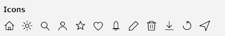
32 built-in vector icons drawn with GPU paths. Scale and color freely.
Declarative
ui.Icon(ui.IconHome)
ui.Icon(ui.IconSettings).Size(32)
ui.Icon(ui.IconStar).Color(ui.RGB(255, 200, 0))
ui.Icon(ui.IconDelete).OnTap(func() { deleteItem() })
Available Icons
IconHome, IconSettings, IconSearch, IconClose, IconAdd, IconRemove, IconEdit, IconDelete, IconCheck, IconChevronLeft, IconChevronRight, IconChevronUp, IconChevronDown, IconMenu, IconUser, IconStar, IconHeart, IconInfo, IconWarning, IconError, IconFolder, IconFile, IconDownload, IconUpload, IconRefresh, IconSend, IconNotification, IconLock, IconUnlock, IconEye, IconEyeOff
Lower-Level
widget.NewIcon(widget.IconHome).WithSize(32).WithColor(col).Layout(gtx, th)
Badge / Chip
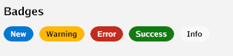
Small label badges with color variants.
Declarative
ui.Badge("New")                              // Primary
ui.Badge("Error").Danger()                   // Red
ui.Badge("Warning").Warning()                // Amber
ui.Badge("Success").Success()                // Green
ui.Badge("Tag").Secondary()                  // Muted
ui.Badge("Removable").OnDismiss(func() { ... }) // With X button
Lower-Level
widget.NewBadge("New").
    WithVariant(widget.BadgeDanger).
    WithOnDismiss(func() { ... }).
    Layout(gtx, th)
Progress Bar

A horizontal progress indicator with animated fill.
Declarative
ui.Progress(0.65)                // 65% filled
ui.Progress(0.3).BarHeight(8)   // Thicker bar

// Update: progress.SetValue(0.8)
Lower-Level
var bar = widget.NewProgressBar(0.65).WithHeight(8)
bar.Layout(gtx, th)
bar.Value = 0.8  // update
TabBar
Tabbed navigation with active indicator.
Declarative
tabs := ui.TabBar("Home", "Profile", "Settings").
    OnSelect(func(index int) {
        currentTab.Set(index)
    })

// Read: tabs.Selected()
// Set: tabs.SetSelected(1)
Lower-Level
var tabs = widget.NewTabBar("Home", "Profile", "Settings").
    WithOnSelect(func(index int) { ... })

tabs.Layout(gtx, th)
ListView
Scrollable list of selectable items.
Declarative
list := ui.ListView().
    Items("Item 1", "Item 2", "Item 3").
    OnSelect(func(index int) { ... })

// With subtitles:
list := ui.ListView().
    ItemWithSub("Title", "Subtitle").
    ItemWithSub("Another", "Description")
Lower-Level
var list = widget.NewListView().
    AddItem("Title", "Subtitle").
    WithOnSelect(func(index int) { ... })

list.Layout(gtx, th)
Dialog
Modal dialogs with OK/Cancel or custom action buttons.
Declarative
dlg := ui.Dialog("Confirm Delete").
    OKText("Delete").
    CancelText("Keep")

confirm := ui.Confirm("Are you sure?")
alert := ui.Alert("Operation complete")

// Show/hide
dlg.Show()
dlg.Hide()

// Place at the end of your view tree (renders on top)
ui.VStack(
    content,
    dlg,  // renders as overlay when visible
)
Lower-Level
var dlg = widget.NewDialog("Confirm").
    WithContent(func(gtx layout.Context) layout.Dimensions { ... }).
    WithOnResult(func(r widget.DialogResult) { ... })

dlg.Show()
dlg.Layout(gtx, th)
AppBar
Top application bar with title and action buttons.
Declarative
ui.AppBar("My App").Actions(
    ui.Icon(ui.IconSettings).OnTap(openSettings),
)
Lower-Level
widget.NewAppBar("My App").
    WithActions(settingsBtn.Layout).
    Layout(gtx, th)
SideNav
Sidebar navigation with collapsible items.
Declarative
nav := ui.SideNav(
    ui.NavItem("Home", "🏠"),
    ui.NavItem("Settings", "⚙"),
    ui.NavItem("About", "ℹ"),
).OnSelect(func(index int) { page.Set(index) }).
  NavWidth(200)
Lower-Level
var nav = widget.NewSideNav(
    widget.NavItem{Label: "Home", Icon: "🏠"},
    widget.NavItem{Label: "Settings", Icon: "⚙"},
).WithOnSelect(func(index int) { ... })

nav.Layout(gtx, th)
Tooltip
Shows a text tooltip on hover.
Declarative
ui.Tooltip("Save changes", ui.Icon(ui.IconDownload))
ui.Tooltip("Delete item", ui.Button("Delete"))
Lower-Level
widget.NewTooltip("Save").
    WithChild(func(gtx layout.Context) layout.Dimensions { ... }).
    Layout(gtx, th)
Image
Render a Go image.Image.
Declarative
img, _ := png.Decode(file)
ui.Image(img).Size(200, 150).Rounded(8)
Divider
A horizontal separator line.
Declarative
ui.Divider()
Lower-Level
widget.NewDivider().Layout(gtx, th)
Spacer
Flexible or fixed spacing between items.
Declarative
ui.Spacer()                // Flexible — expands to fill
ui.FixedSpacer(16, 0)     // Fixed 16dp horizontal
ui.FixedSpacer(0, 20)     // Fixed 20dp vertical
Lower-Level
widget.NewSpacer(16, 0).Layout(gtx)
Navigator
Stack-based page navigation with animated transitions (slide, fade, slide-up).
Declarative
nav := ui.Navigator().
    Route("home", func() ui.View { return homePage() }).
    Route("settings", func() ui.View { return settingsPage() }).
    Transition(ui.TransitionSlide)

nav.Push("home")       // initial page
nav.Push("settings")   // slides in from right
nav.Pop()              // slides back to home
nav.Replace("about")   // swap without animation
nav.CanPop()           // true if stack depth > 1
nav.Current()          // "home"
Lower-Level
var nav = widget.NewNavigator().
    WithRoute("home", homeLayout).
    WithRoute("settings", settingsLayout).
    WithTransition(widget.TransitionSlide).
    WithDuration(300 * time.Millisecond)

nav.Push("home")
nav.Layout(gtx, th)
DataGrid
A sortable, scrollable data table with column headers and row selection.
Declarative
grid := ui.DataGrid(
    ui.Col("Name"),
    ui.ColFixed("Email", 250),
    ui.Col("Status"),
).
    AddRow("Alice", "alice@example.com", "Active").
    AddRow("Bob", "bob@example.com", "Inactive").
    OnRowSelect(func(index int) { ... }).
    Striped(true)
Lower-Level
var grid = widget.NewDataGrid(
    widget.Column{Header: "Name", Sortable: true},
    widget.Column{Header: "Email", Width: 250},
    widget.Column{Header: "Status", Sortable: true},
).WithRows(data).WithOnRowSelect(fn).WithStriped(true)

grid.Layout(gtx, th)
TreeView
Expandable hierarchical list with animated expand/collapse.
Declarative
tree := ui.Tree(
    ui.TreeNode("Documents").WithIcon(widget.IconFolder).WithChildren(
        ui.TreeNode("readme.txt").WithIcon(widget.IconFile),
        ui.TreeNode("notes.txt").WithIcon(widget.IconFile),
    ).WithExpanded(true),
    ui.TreeNode("Images").WithIcon(widget.IconFolder),
).OnSelect(func(node *ui.TreeNodeView) {
    fmt.Println("Selected:", node.Label)
})
Lower-Level
var tree = widget.NewTreeView(
    widget.NewTreeNode("Root").WithChildren(
        widget.NewTreeNode("Child 1"),
        widget.NewTreeNode("Child 2"),
    ).WithExpanded(true),
).WithOnSelect(fn)

tree.Layout(gtx, th)
Accordion
Vertically stacked collapsible sections with animated height.
Declarative
acc := ui.Accordion().
    SectionExpanded("General", generalContent).
    Section("Advanced", advancedContent).
    Section("Debug", debugContent).
    SingleOpen(true)
Lower-Level
var acc = widget.NewAccordion().
    AddSectionExpanded("General", generalWidget).
    AddSection("Advanced", advancedWidget).
    WithSingleOpen(true)

acc.Layout(gtx, th)
Drawer
A slide-out overlay panel with scrim and dismiss-on-click-outside.
Declarative
drawer := ui.Drawer(menuContent).Width(280).RightSide()

drawer.Open()
drawer.Close()
drawer.Toggle()
drawer.IsOpen() // bool

// Place at end of view tree (renders as overlay)
ui.VStack(mainContent, drawer)
Lower-Level
var drawer = widget.NewDrawer().
    WithContent(menuWidget).
    WithWidth(280).
    WithSide(widget.DrawerRight)

drawer.Open()
drawer.Layout(gtx, th)
Snackbar / Toast
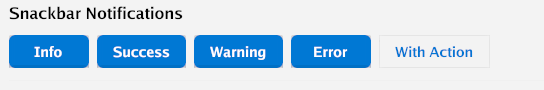
Non-blocking toast notifications that auto-dismiss.
Declarative
snack := ui.SnackbarManager()

snack.Show("File saved")
snack.ShowSuccess("Upload complete")
snack.ShowError("Connection failed")
snack.ShowWarning("Low disk space")
snack.ShowWithAction("Deleted item", "Undo", undoFn)

// Place at end of view tree
ui.VStack(content, snack)
Lower-Level
var snack = widget.NewSnackbar().WithMaxShown(3)

snack.Show("Hello")
snack.Layout(gtx, th)
ContextMenu
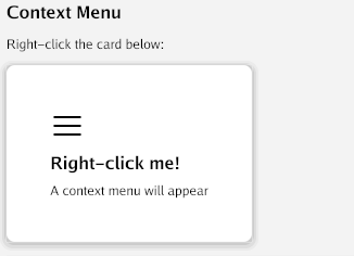
Right-click context menu overlay.
Declarative
ui.ContextMenu(content,
    ui.MenuEntry("Copy", copyFn),
    ui.MenuEntryIcon("Delete", ui.IconDelete, deleteFn),
    ui.MenuDivider(),
    ui.MenuEntry("Properties", propsFn),
)
Lower-Level
var menu = widget.NewContextMenu(
    widget.MenuItem{Label: "Copy", OnClick: copyFn},
    widget.MenuSeparator(),
    widget.MenuItem{Label: "Delete", Icon: widget.IconDelete, OnClick: deleteFn},
)

// Wrap content
menu.LayoutTrigger(gtx, th, contentWidget)
menu.LayoutOverlay(gtx, th)
DatePicker
A date field with calendar popup for date selection.
Declarative
picker := ui.DatePicker(time.Now()).
    OnChange(func(t time.Time) {
        fmt.Println("Selected:", t.Format("2006-01-02"))
    }).
    Placeholder("Choose date...")

// Read: picker.Value()
Lower-Level
var picker = widget.NewDatePicker(time.Now()).
    WithOnChange(func(t time.Time) { ... })

picker.Layout(gtx, th)
RichText
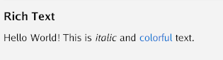
Multiple styled text spans on a single line.
Declarative
ui.RichText(
    ui.TextSpan("Hello "),
    ui.BoldSpan("World"),
    ui.ColorSpan("!", ui.RGB(255, 0, 0)),
    ui.ItalicSpan(" (italic)"),
    ui.SizedSpan("big", 24),
)
Lower-Level
rt := widget.NewRichText(
    widget.Span("Normal "),
    widget.BoldSpan("Bold "),
    widget.ColorSpan("Red", color.NRGBA{R: 255, A: 255}),
)
rt.Layout(gtx, th)
Prototype (AI-Generated UI)
Generate a UI view from a natural language description at runtime. Useful for rapid exploration and prototyping.
Declarative
// Generate a view from description (async, shows placeholder while generating)
ui.Prototype("a login form with email and password fields")

// With modifiers
ui.Prototype("a settings panel").Padding(16).MaxWidth(600)

// Eject the generated Go source code
proto := ui.Prototype("a dashboard with stats cards")
proto.Eject() // prints Go code to stdout
The prototype widget:
- Shows “Generating…” on first render
- Calls the AI to generate a JSON widget tree
- Maps the JSON to real
uiviews (VStack, HStack, Text, Button, Input, Card, etc.) - Also stores the equivalent Go source code for ejection
Supported JSON widget types: VStack, HStack, Text, Button, Input, Card, Spacer, Divider, Toggle, Checkbox, Progress.
Unknown types render as [unsupported: TypeName].